Revisions, Revisions.
I'm making progress. And still learning from mistakes.
I'm recording all this for whoever is following, but also for myself since I refer back to these notes.
I did a pretty good job of getting the Corel Draw drawing "camera ready".
But I made two key mistakes. Both are related to the needs of the Alps printer.
I knew that the minimum line thickness Alps can handle is .0017 inches.
What I did NOT know is that what ever small amount I use needs to be in INCREMENTS of .0017".
Some of my lines were .0021"-- not good. SO I needed to go with either .0017 or .0034.
The next mistake I did was forget to export a visual file in bitmap form to see what it will look like. I had done this early in the process, but forgot to do it at the end as a final check.
To do the export....
1. Make all layers you want to export VISUAL, UNLOCKED, And PRINTABLE. See on the previous page where these icons are in the layers box on the right. An eye symbol, a pencil symbol and a printer symbol.
2. Then select (draw the cursor around) all objects you want to look at.
3. Click the EXPORT button, or use CTR-E.
4. Choose PNG file type, give it a name. Make sure you CHECK the box for SELECTED ONLY (or you will do the whole drawing- not just what you want). Click EXPORT.
5. Box pops up. Size: 1:1, Choose Resolution- CUSTOM and 600 x 600 resolution. UN-check anti-aliasing. Leave rest. Click OK. Another little box about interlacing. Do nothing, click OK.
Now look at the PNG file you just created. This will give you an idea of what the printer will do.
Here is a critical part of my decal.

On the left side, the Text herald is in two experimental versions. The bottom three have a pen width for the letter outline set at .0017".
The top one is set at .0034". Both look OK, but I like the finer outline better.
We will see how it prints.
But I discovered a problem. Look right at the builder's plates.
The GE logo plate turned out fine. But the smaller plate with the model and serial number looks terrible. WAY too much gold with just a couple of flecks of black. No what I was wanting.
So I went back and deleted some of the info using fewer lines. You can't read it anyway, so the overall effect and appearance is what we want.
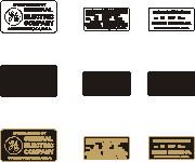
So here is a test.
GE plate on the left.
Original smaller plate in the middle.
The simplified plate on the right.
At this resolution, the edited simplified plate looks better.
So that's what I'll go with.
