Hello all,
The following is a new design concept for a freelance branch line that has been the theme of two small layouts that I have built in the past. The Marmion Valley RY is a struggling short line serving a fertile agricultural hub "somewhere" in inland Southern California, set in the late 1930's.
The Space:
First off, I'll let you know that an "Island" style layout is not usually my preferred design medium. I have always prescribed to the opinion that the for the best use of space, and for the most prototypical viewing experience, Shelf style or Around-the-Walls Layouts are the way to go. The mainline only travels through each scene once, and the viewing perspective forces the viewer to engage in one portion of the layout at a time, increasing the perception of distance.
Our current household has only one space for trains: the garage. I have access to a portion of one wall, which currently is home for my shelf switching layout. However, my thoughts have turned to designing another layout to satisfy the following criteria:
1. Continuous run for "crack a cold one and watch 'em roll" operation.
2. Track/scenery ratio that favors scenery.
3. Portability for possible show exposition, future moves, or future sale of layout to another owner.
4. Track passes through each scene only once
5. Highly controlled viewing angles for LDE's/'scenes.'
My inspiration comes from great "railfanning"/Island style layouts like Lyn St. Laurent's SP Coast Line, and John Leaders' Marias Pass.
So, here's the plan as of today:

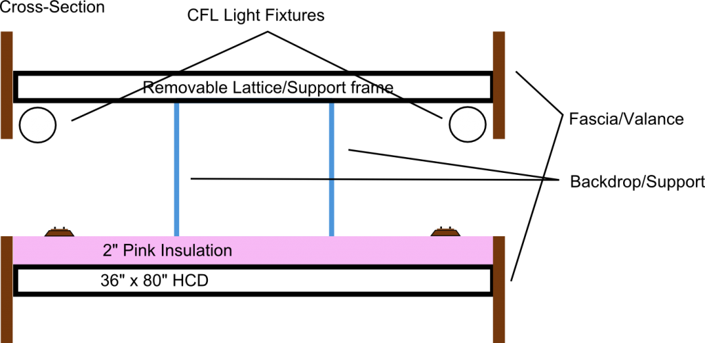
I have decided to toss around the concept of a "vignette" or "shadowbox" style of design, inspired from another post that I read in the archives here on the Railwire. As you can see, there is an ovoid backdrop down the center, which supports a valance and lighting frame that will frame the layout like a sandwich. Check out the cross-section here:

This way, the viewer is forced to follow the train around the layout, viewing it much in the same way a shelf layout would be viewed.
Why not just use a double-sided backdrop? The one issue I have with the traditional single-divider, double-sided backdrop is that it has to have a definite end that needs to be dealt with scenically. Even if you have the background stretch from end to end, then you have to come up with an elegant solution to hiding the hole that the track must pass through.
With the above design, the background is "seamless," in the sense that it has no hard edges to hide.
Trackplan:
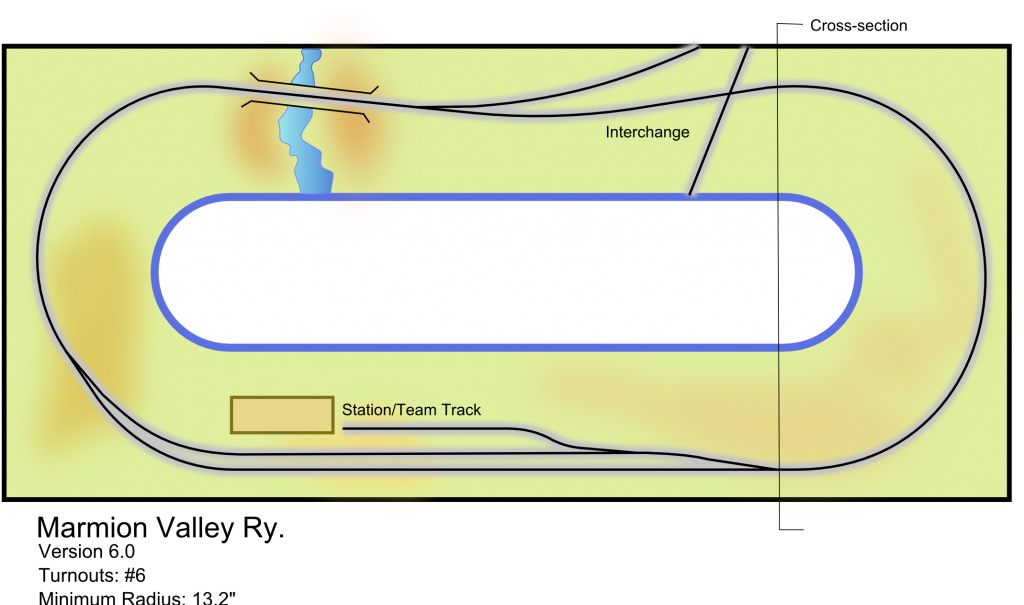
The track plan is very simple, intentionally. One of my first goals was to capture the flavor of a meandering single-track branch line, creating a realistic scene proportionate to the space. Right now it involves only 4 #6 turnouts, and a crossover for the "dummy" interchange diamond (which is on the list of possible "eliminations" for future revisions). The passing siding in "town" can hold a locomotive, 9 40' cars, and caboose. Not too much more operationally but "show" running, possibly some meets; one could drop cars at the interchange or house track.
Originally, the concept was that one side of the layout would be a hidden staging ladder so that different trains could take turns appearing "on stage," but as of now I prefer using all of the available real estate for visible scenes.
At this point, it's just a concept. I'd appreciate some feedback or ideas on the general concept or specifically, on the trackplan.